Vinyl Design, Ideomatic: Körper Kontrol EP
Vinyl Cover 2014Project: Vinyl Design
Ideomatic: Körper Kontrol EP Vinyl Cover 2014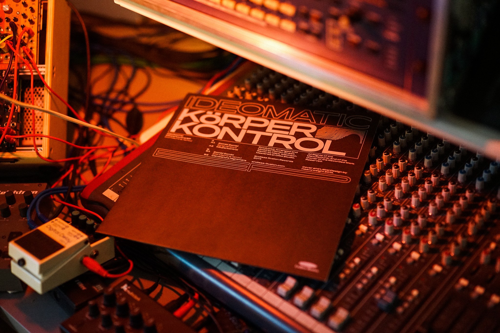
Vinyl Cover
01 Vinyl Cover

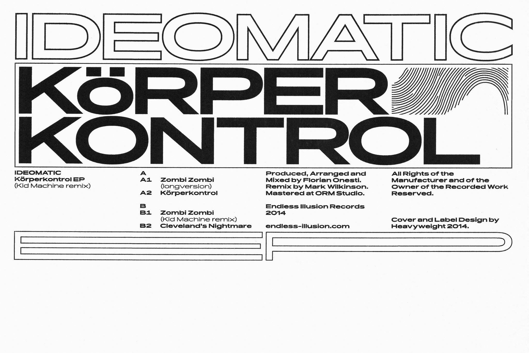
Risograph Poster
02 Risograph Poster

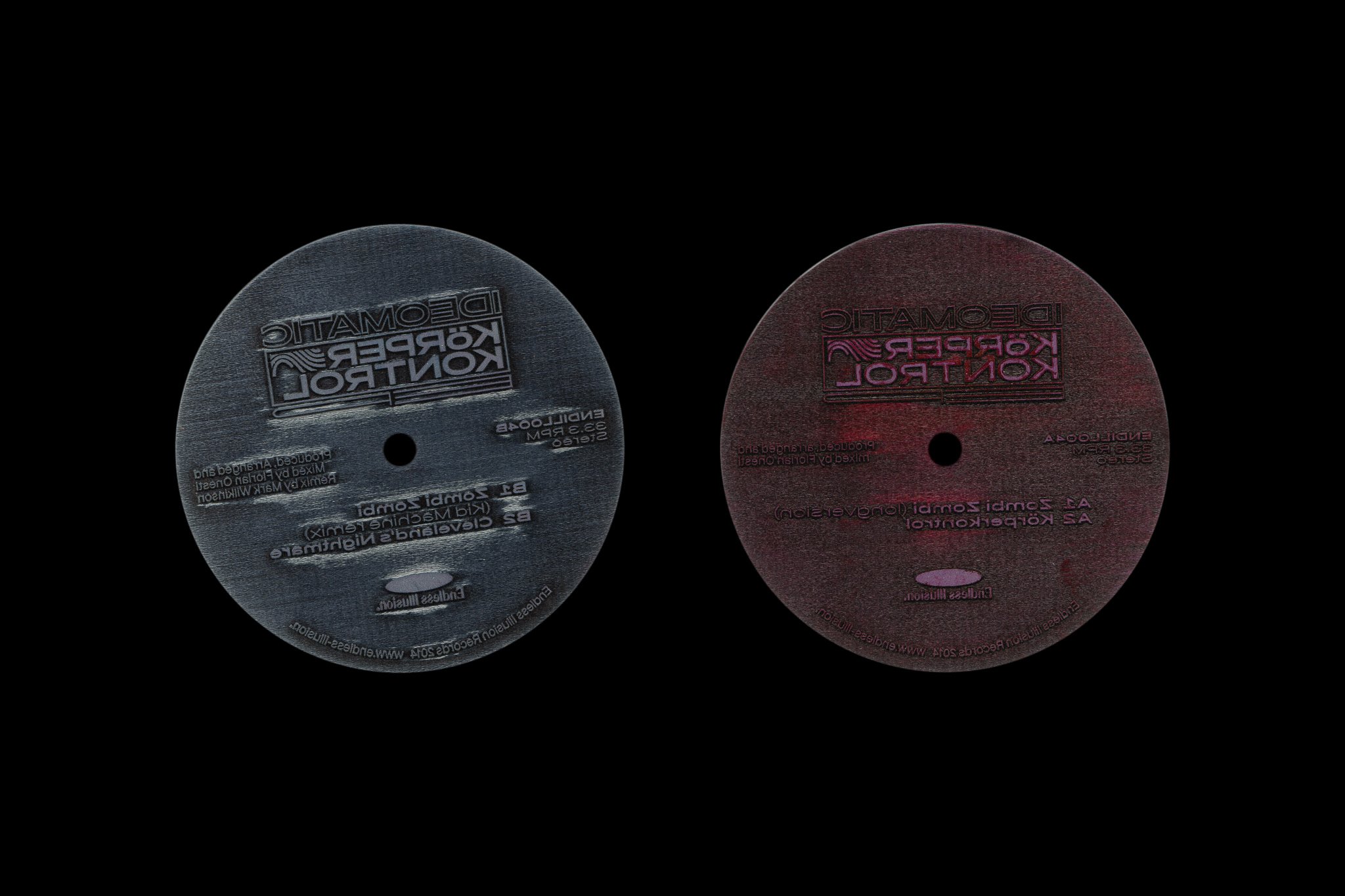
Stamps Preview
03 Stamps Preview

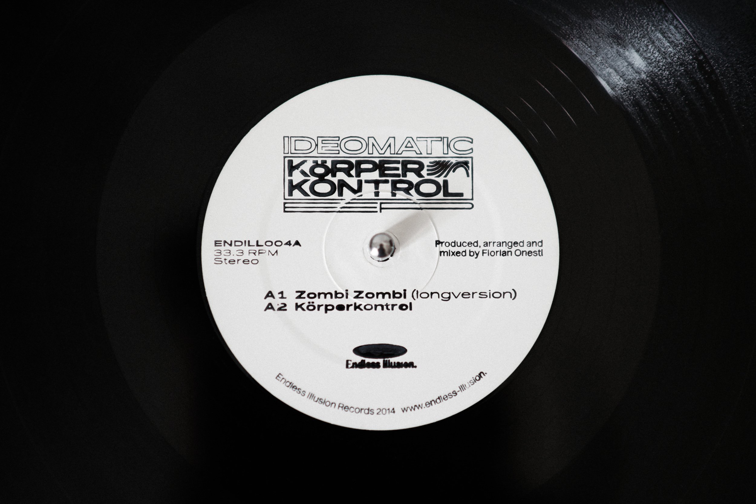
Stamped Vinyl Label
04 Stamped Vinyl Label

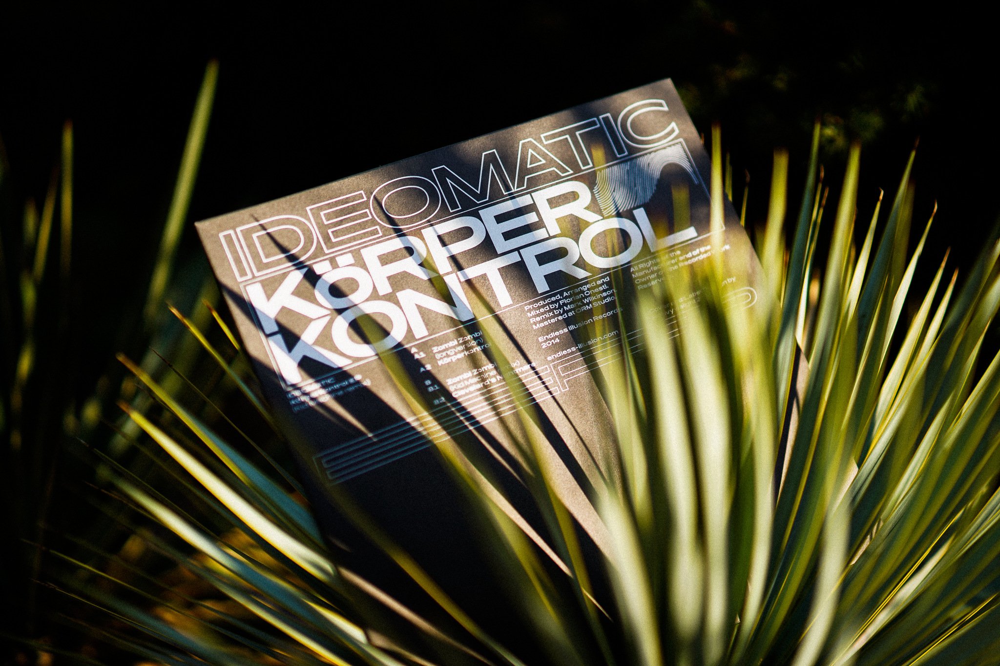
Vinyl Cover
05 Vinyl Cover

Körper Kontrol is a unique project for us for many reasons. It should be said at the start that it is the name of a musical EP by a French interpreter who performs under the name Ideomatic. The first thing that makes the project unique is the fact that it is the first physical music carrier made in the shape of a vinyl record. It is made by the Endless Illusion music publishers, which we also count amongst our friends. We’ve spent many Friday nights telling exciting stories from the world of type design at parties organised at clubs associated with the music grouping. Releasing a physical carrier – a vinyl one at that! – was something that, up until then, we’d only dreamed about, because it’s relatively expensive, plus the fact that the music itself didn’t fit in with an easily marketable mainstream genre. Decisions on production also included an estimation of the potential of the performer in question who’s little known to the public when they started out, so it’s quite a risky project in itself. It’s not so much about what the disk looks or sounds like; the key factors are luck and your ability to market the release. Due to the very low budget, we decided to use manual silkscreen printing. For the round labels we had special stamps produced that used a mechanism to allow you to print manually, so you do it bit by bit and without the certainty that it’ll turn out well. Our intention was for every disk to be an original and for the manual work to be visible. However, silkscreen printing on existing disks was a test of nerves. The composition of the sleeve visual was based on a design taking up only half of the format, an element we used countless times afterwards for Endless Illusion. We also got massive satisfaction from the decision to use the Pano font, which at the barely had a complete alphabet. After deep consideration, we wouldn’t be afraid to say that it was probably the first-ever use of the font in this kind of printed, real-world application. During this project we assured ourselves of our shared taste, which has been shaping our activities ever since.
Körper Kontrol is a unique project for us for many reasons. It should be said at the start that it is the name of a musical EP by a French interpreter who performs under the name Ideomatic. The first thing that makes the project unique is the fact that it is the first physical music carrier made in the shape of a vinyl record. It is made by the Endless Illusion music publishers, which we also count amongst our friends. We’ve spent many Friday nights telling exciting stories from the world of type design at parties organised at clubs associated with the music grouping. Releasing a physical carrier – a vinyl one at that! – was something that, up until then, we’d only dreamed about, because it’s relatively expensive, plus the fact that the music itself didn’t fit in with an easily marketable mainstream genre. Decisions on production also included an estimation of the potential of the performer in question who’s little known to the public when they started out, so it’s quite a risky project in itself. It’s not so much about what the disk looks or sounds like; the key factors are luck and your ability to market the release. Due to the very low budget, we decided to use manual silkscreen printing. For the round labels we had special stamps produced that used a mechanism to allow you to print manually, so you do it bit by bit and without the certainty that it’ll turn out well. Our intention was for every disk to be an original and for the manual work to be visible. However, silkscreen printing on existing disks was a test of nerves. The composition of the sleeve visual was based on a design taking up only half of the format, an element we used countless times afterwards for Endless Illusion. We also got massive satisfaction from the decision to use the Pano font, which at the barely had a complete alphabet. After deep consideration, we wouldn’t be afraid to say that it was probably the first-ever use of the font in this kind of printed, real-world application. During this project we assured ourselves of our shared taste, which has been shaping our activities ever since.