Premiére Font, Aero Films
Custom Typeface 2015Project: Premiére Font
Aero Films Custom Typeface 2015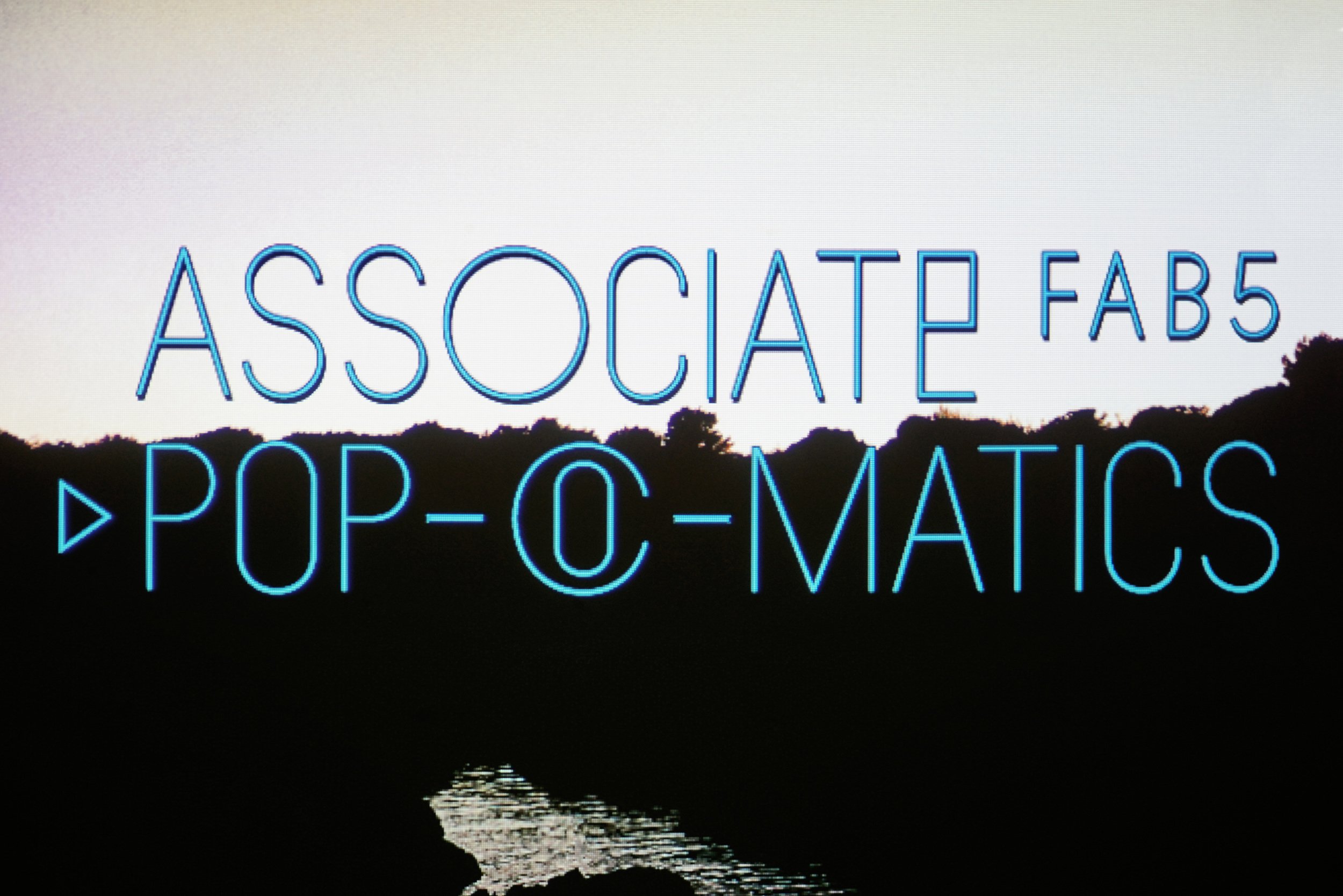
Screen preview
01 Screen preview

Character Set Overview
02 Character Set Overview

Projection, headlines
03 Projection, headlines

Projection, captions
04 Projection, captions

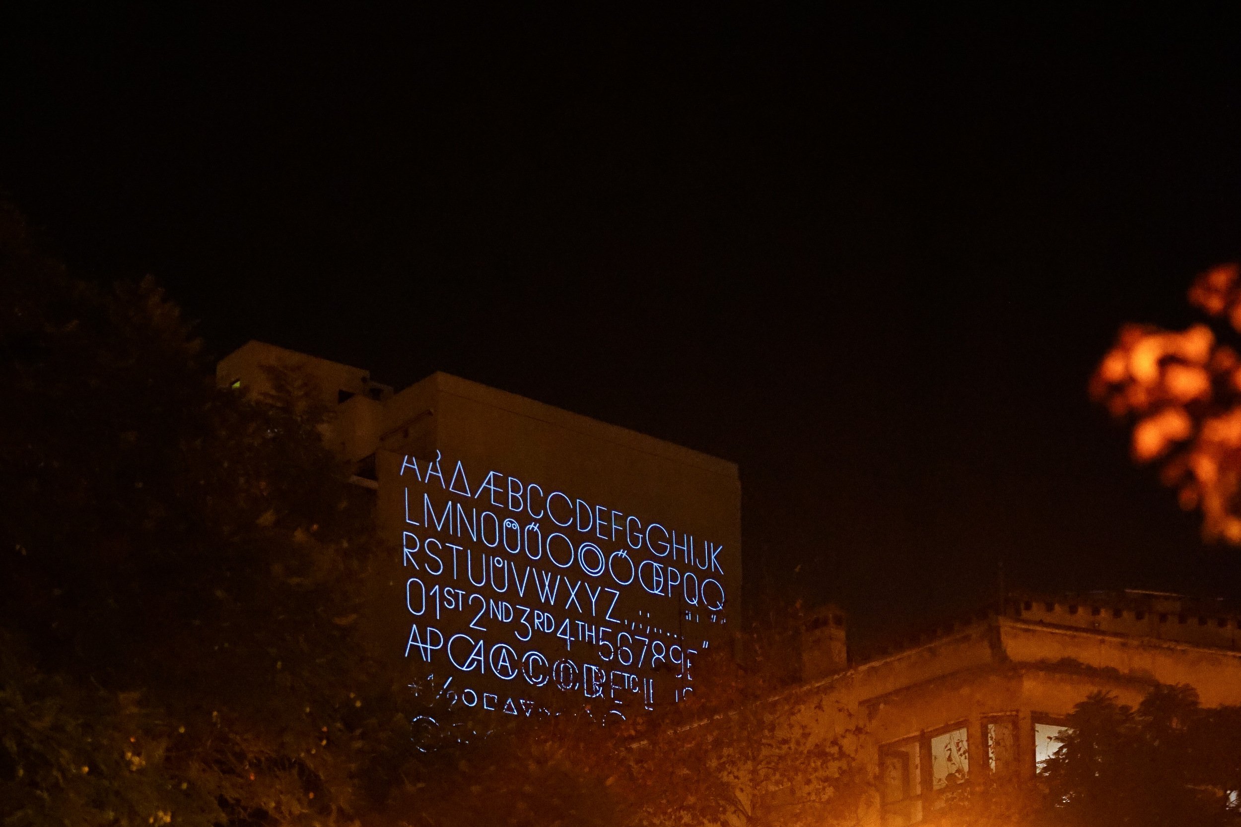
Projection, character set
05 Projection, character set

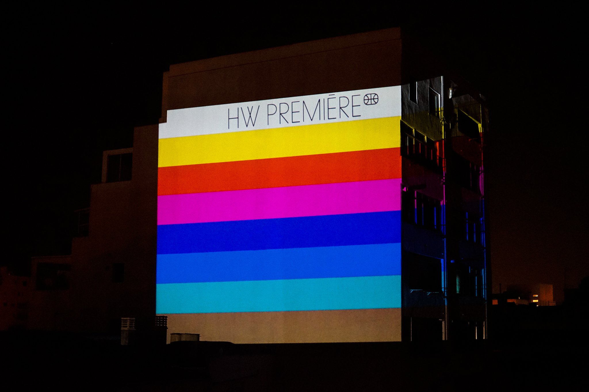
Projection, font logo
06 Projection, font logo

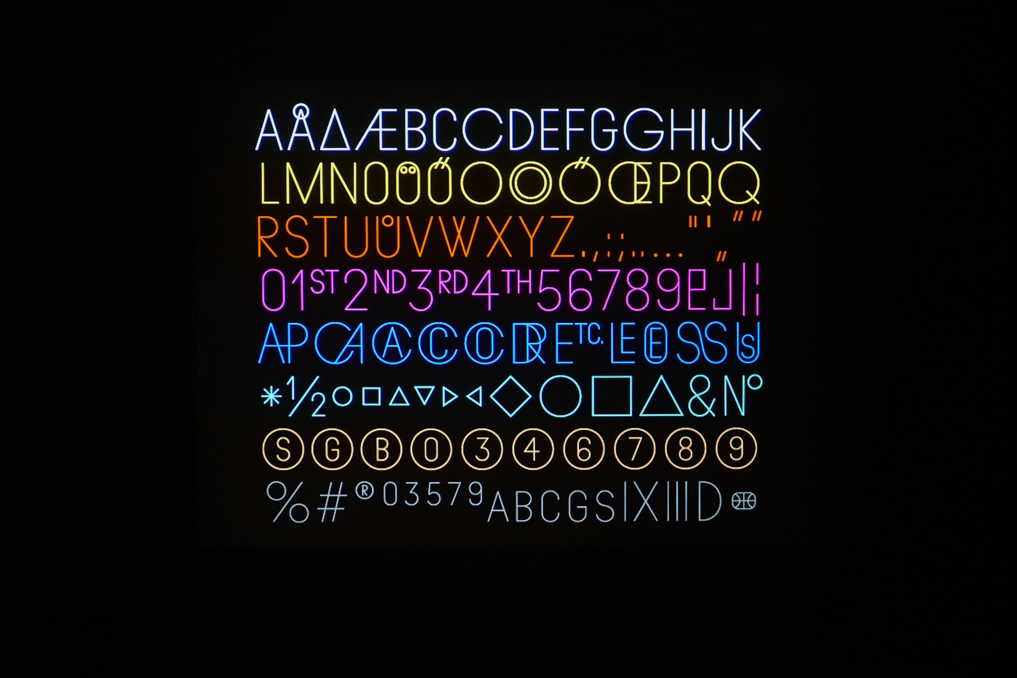
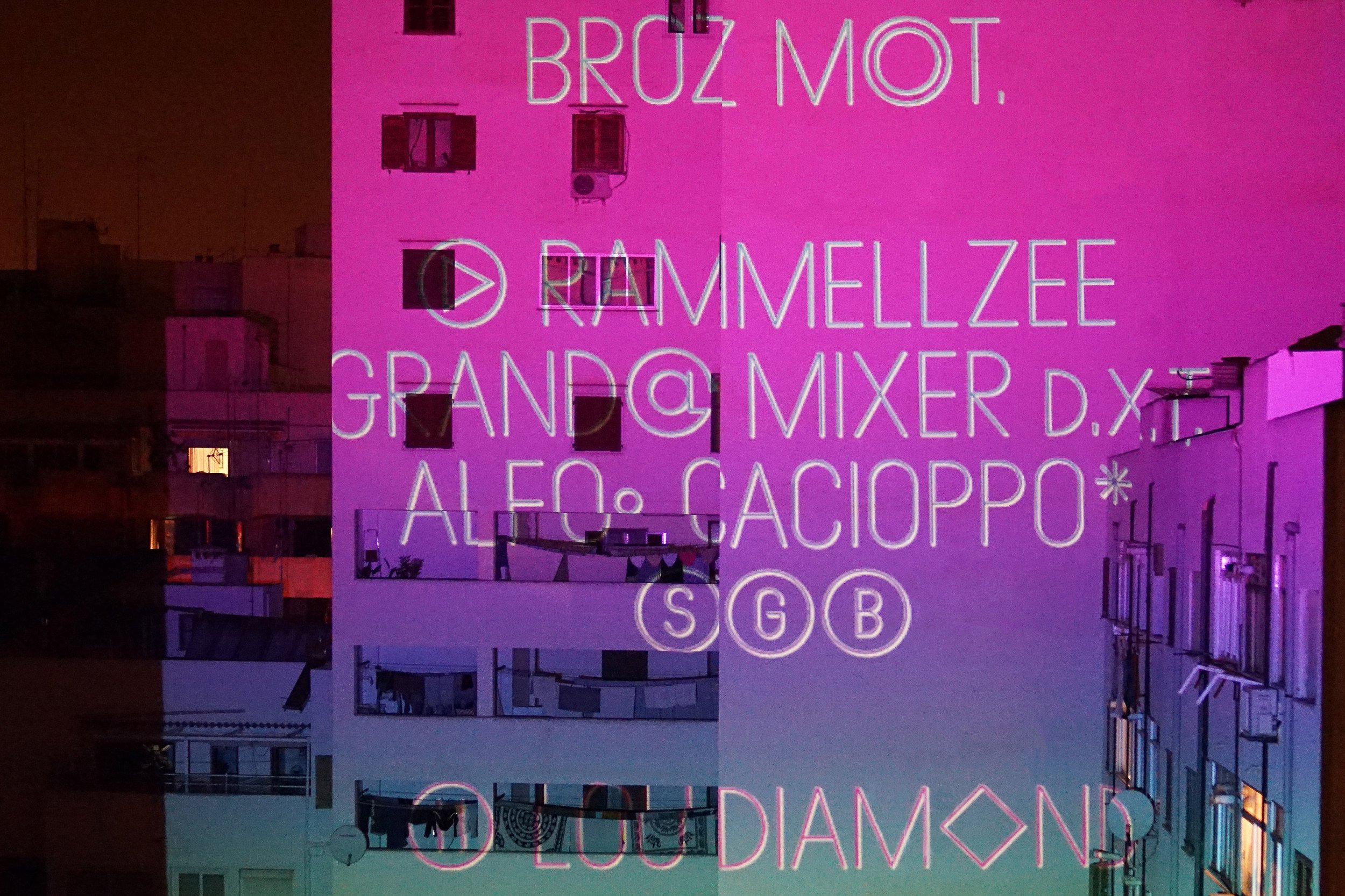
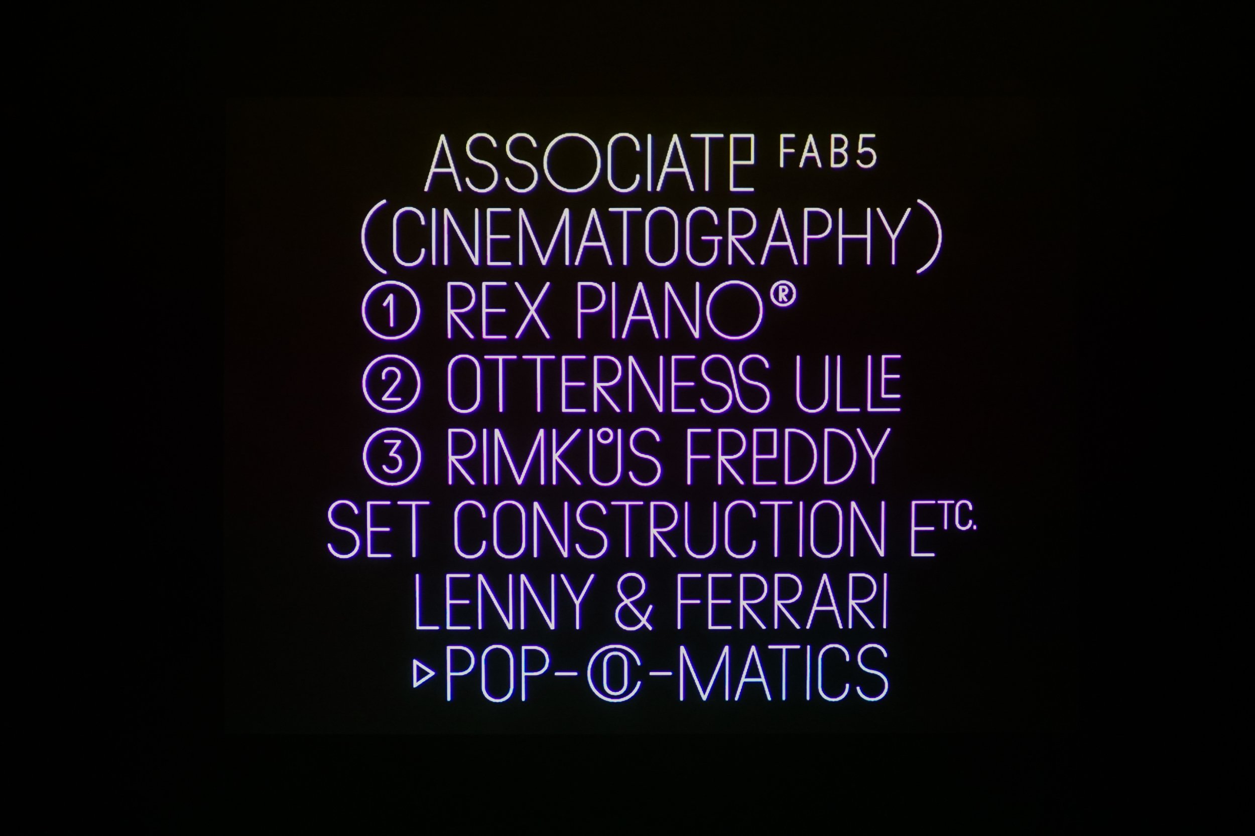
The Premiére font was one of the relatively long-term projects that we undertook together with the ExLovers studio for Aerofilms, the operator of several independent cinemas in Prague. Up until then the cinemas had operated individually and, in line with contemporary tendencies, it made sense to create an identity through a shared font that, amongst other things, would help viewers to orientate themselves better. The main vision was an online database system for the viewing of films and trailers, and obviously the cinema programme, where it was easier to buy a ticket than before. This, relatively fundamental, change was presented in ExLovers’ usual, striking style and was based, to a large extent, on the typography which, as was written in the assignment, was to be universal, but also thematic. Together with ExLovers we had a similar perspective of the matter with regard to morphology and the overall look of the specific font, which we gave the working name of Premiére. So a graphically constructed font with geometry reminiscent of characters used on film and television equipment came into being. The ambition was for the font to stand out in headings and texts with large letters or uppercase – lowercase wasn’t planned for use at all. An important aspect was the potential for variable use, so we designed a subtle display version, three Condensed, Normal and Extended cross-sections in differing proportions, and a Mono version, which was used primarily in tables and programmes. Premiére also has a broad range of character in the dingbats section for topics associated with television and cinema. Worth mentioning are, for example, the characters symbolising “play”, “rewind”, “record” and other. The Premiére family of fonts is expected to be used further in the future, for which we have a broader range of cross-sections, which will be available in the near future. The Premiére font was also used in accompanying printed materials and on online posters for music publishers Endless Illusion.
The Premiére font was one of the relatively long-term projects that we undertook together with the ExLovers studio for Aerofilms, the operator of several independent cinemas in Prague. Up until then the cinemas had operated individually and, in line with contemporary tendencies, it made sense to create an identity through a shared font that, amongst other things, would help viewers to orientate themselves better. The main vision was an online database system for the viewing of films and trailers, and obviously the cinema programme, where it was easier to buy a ticket than before. This, relatively fundamental, change was presented in ExLovers’ usual, striking style and was based, to a large extent, on the typography which, as was written in the assignment, was to be universal, but also thematic. Together with ExLovers we had a similar perspective of the matter with regard to morphology and the overall look of the specific font, which we gave the working name of Premiére. So a graphically constructed font with geometry reminiscent of characters used on film and television equipment came into being. The ambition was for the font to stand out in headings and texts with large letters or uppercase – lowercase wasn’t planned for use at all. An important aspect was the potential for variable use, so we designed a subtle display version, three Condensed, Normal and Extended cross-sections in differing proportions, and a Mono version, which was used primarily in tables and programmes. Premiére also has a broad range of character in the dingbats section for topics associated with television and cinema. Worth mentioning are, for example, the characters symbolising “play”, “rewind”, “record” and other. The Premiére family of fonts is expected to be used further in the future, for which we have a broader range of cross-sections, which will be available in the near future. The Premiére font was also used in accompanying printed materials and on online posters for music publishers Endless Illusion.