Novo Font, Nanovo Vintage Furniture
Custom Typeface 2013Project: Novo Font
Nanovo Vintage Furniture Custom Typeface 2013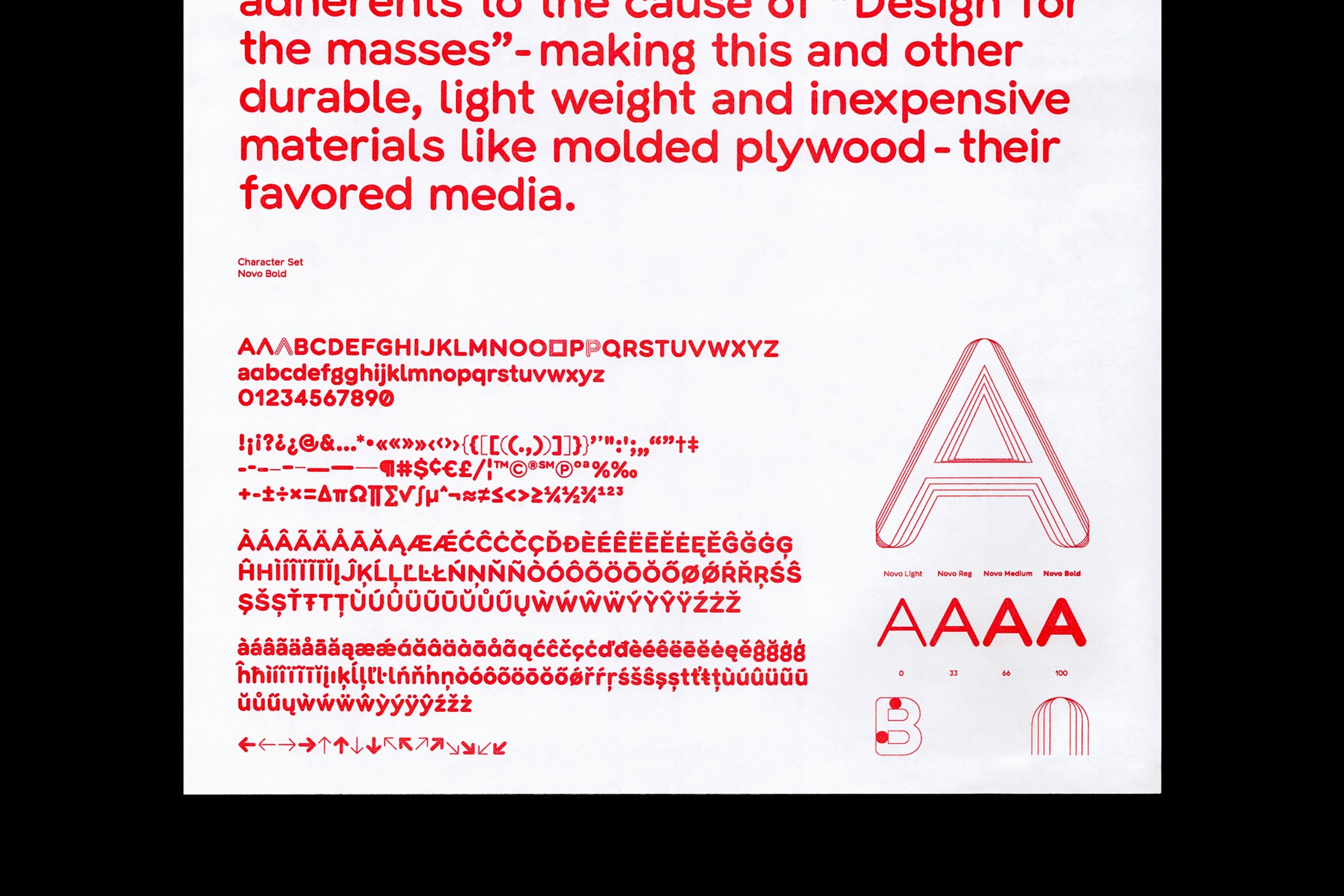
Character Set Overview
01 Character Set Overview


Printed specimen, spread 1
02 Printed specimen, spread 1

Text Sample and Styles
03 Text Sample and Styles

Printed specimen, spread 2
04 Printed specimen, spread 2

Printed specimen, spread 3
05 Printed specimen, spread 3

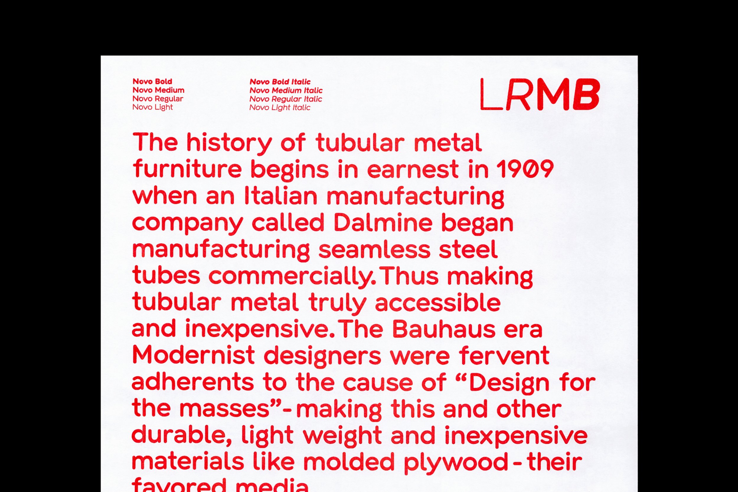
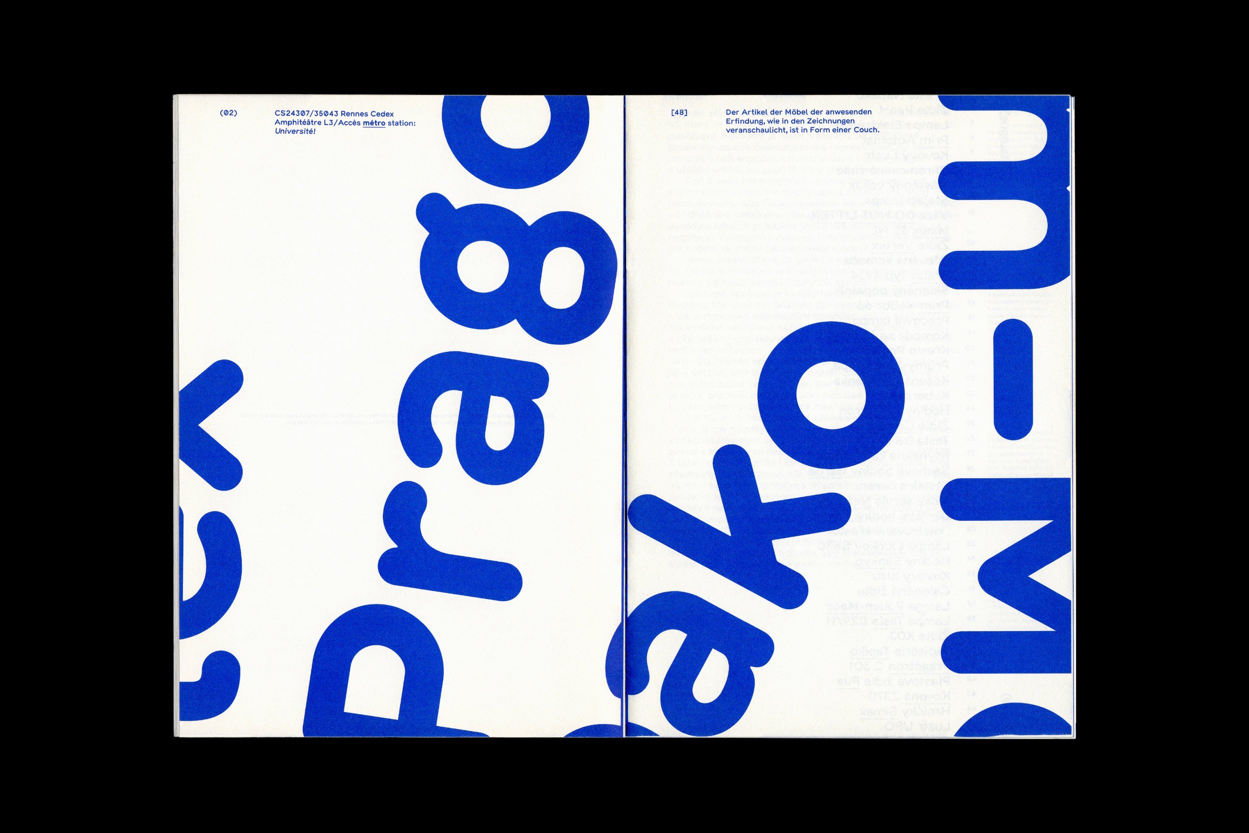
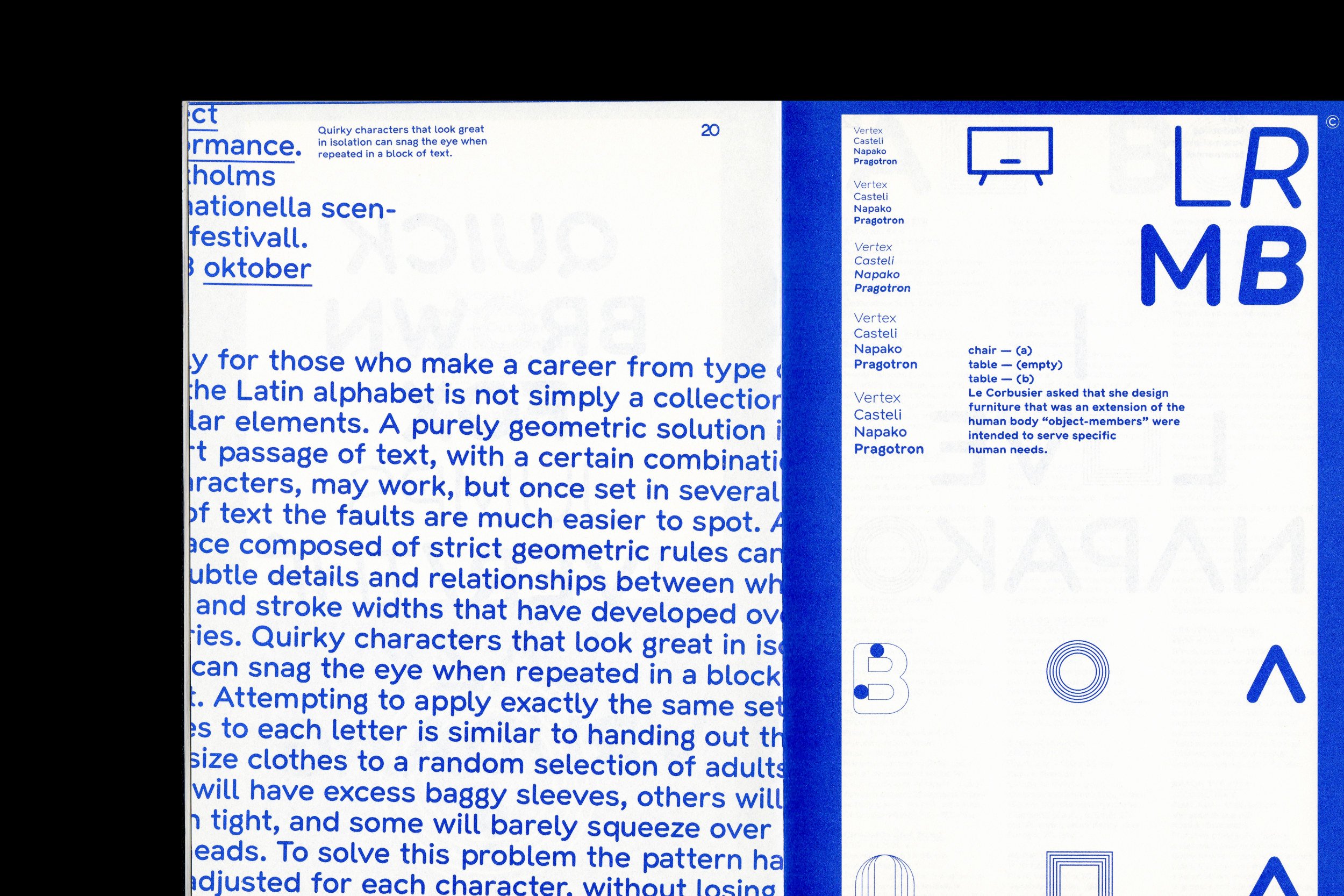
Novo is the name of a font designed especially for the company Nanovo, which is involved in “hunting out” visual heritage, in the form of furniture or accessories, from both the local and the international environment. They endeavour to successfully renovate these artefacts and bring them back into use, or even get in touch with the original designers, with whom they then work together on their evergreens, which are then sold again on the market. This commendable project is a classic example of one that cries out for a specially designed font, about which we were contacted even before we founded Heavyweight in 2010. The task of the font is to take a contemporary approach to the construction of characters in response to the typographical morphology of the time, which occasionally appeared on the products themselves, and which served as one of our inspirations. The particularly popular products came from the Pragotron, Vertex, Prim, Napako and Tesla brands, and others. You could say that the Novo font is a kind of reminiscence of the design of the time, and it’s also because we’re fans of it and we don’t hide our admiration of specific examples that we see as timeless. Indeed, it’s not just us: Nanovo and its target group are direct evidence of the interest in high-quality furniture, art and design from the second half of the 20th century. The font is in the “rounded” category, which is obvious at first glance. These rounded elements don’t appear in only the end of stems, but also in the structures themselves, and this principle enriches the fonts in all four styles: Light, Regular, Medium and Bold. Ultimately, this key element is promoted the most by our alternatively, graphically designed glyphs, which clearly show the legacy of recent history. While the aforementioned curves significantly restrict the options for both designing the font, they’re a sufficiently distinct element that in this case, all we had to do was focus on the proportions. Probably the only surprises in the morphology itself are e.g. the lowercase “g” character, the double ductus in the brackets, and some punctuation marks.
Novo is the name of a font designed especially for the company Nanovo, which is involved in “hunting out” visual heritage, in the form of furniture or accessories, from both the local and the international environment. They endeavour to successfully renovate these artefacts and bring them back into use, or even get in touch with the original designers, with whom they then work together on their evergreens, which are then sold again on the market. This commendable project is a classic example of one that cries out for a specially designed font, about which we were contacted even before we founded Heavyweight in 2010. The task of the font is to take a contemporary approach to the construction of characters in response to the typographical morphology of the time, which occasionally appeared on the products themselves, and which served as one of our inspirations. The particularly popular products came from the Pragotron, Vertex, Prim, Napako and Tesla brands, and others. You could say that the Novo font is a kind of reminiscence of the design of the time, and it’s also because we’re fans of it and we don’t hide our admiration of specific examples that we see as timeless. Indeed, it’s not just us: Nanovo and its target group are direct evidence of the interest in high-quality furniture, art and design from the second half of the 20th century. The font is in the “rounded” category, which is obvious at first glance. These rounded elements don’t appear in only the end of stems, but also in the structures themselves, and this principle enriches the fonts in all four styles: Light, Regular, Medium and Bold. Ultimately, this key element is promoted the most by our alternatively, graphically designed glyphs, which clearly show the legacy of recent history. While the aforementioned curves significantly restrict the options for both designing the font, they’re a sufficiently distinct element that in this case, all we had to do was focus on the proportions. Probably the only surprises in the morphology itself are e.g. the lowercase “g” character, the double ductus in the brackets, and some punctuation marks.