FAMU Fest, Film and TV School of Academy of Performing Arts in Prague (FAMU)
Identity 2015Project: FAMU Fest
Film and TV School of Academy of Performing Arts in Prague (FAMU) Identity 2015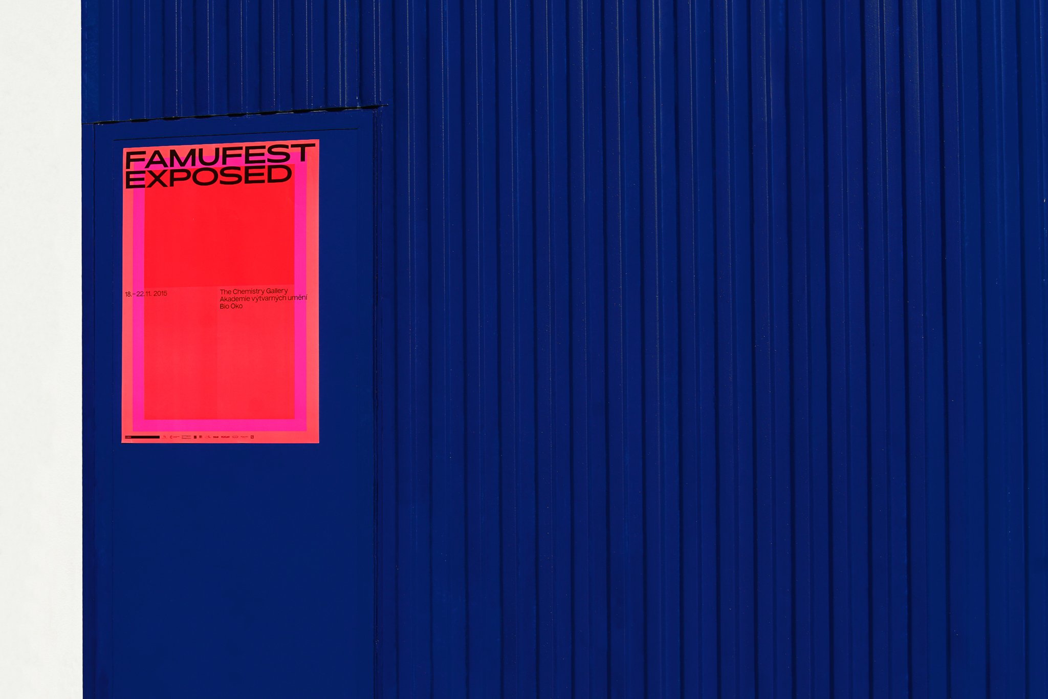
Poster
01 Poster

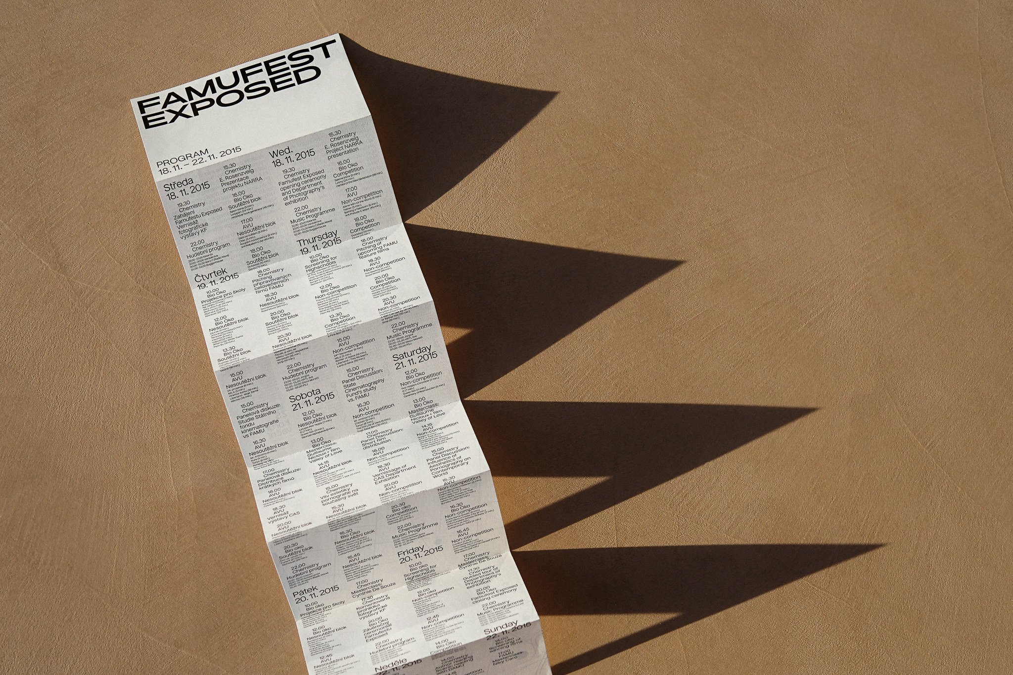
Programme
02 Programme

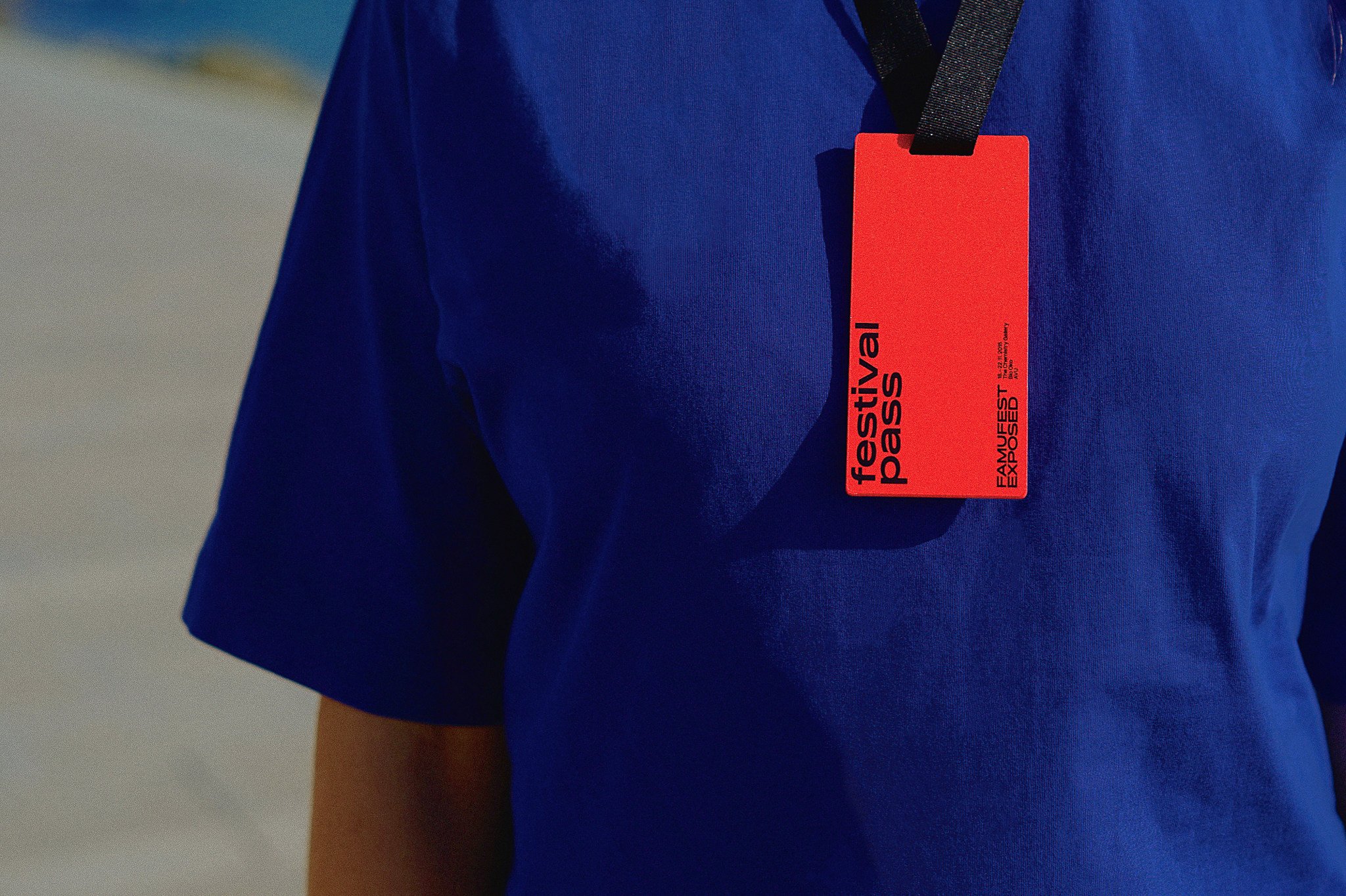
Festival Pass
03 Festival Pass

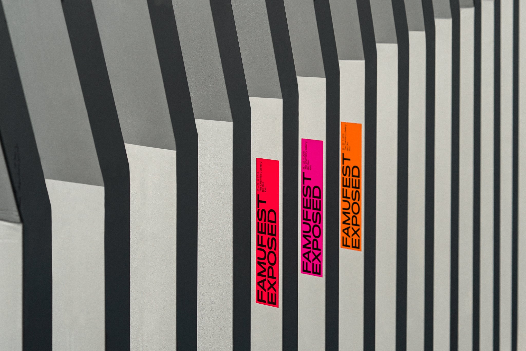
Stickers
04 Stickers

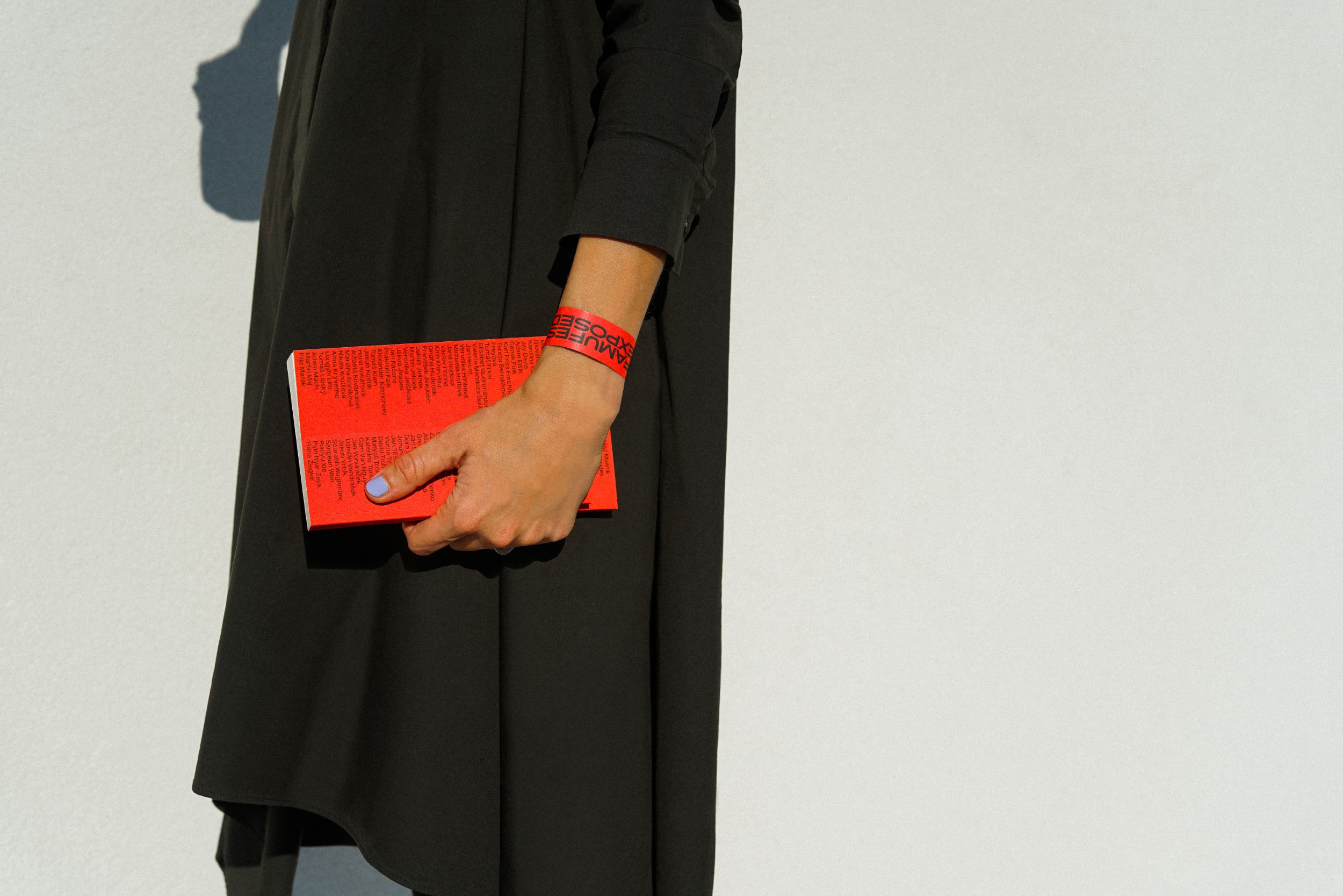
Catalog
05 Catalog

In 2015 another edition of the Famufest festival, organised by the famous FAMU film faculty in Prague, took place. As is the case every year, the festival was given a themed subtitles, which this year was the rather provocative “Exposed”. We were invited to take part in this project by Luboš Rezler, Martina Netíková and Alžběta Nollová, with whom we collaborated on the visual aspect of the event throughout the preparation process. Our collaboration permeated through to both the graphical and pictorial outputs, such as jingles and so on, that were intended to introduce and promote the festival. In both the initial sketches and subsequent samples we saw various shades of reddish colours, which flowed through to orange via pink, looking like one colour from a distance. Incidentally, more than a few times our colleagues from FAMU mentioned the name of James Turrell, in whose work we can also find a certain optical illusion presented using a similar colour spectrum. So we placed the building block for the festival’s visual identity, which couldn’t be missed, in all applications, including the online programme, printed applications, leaflets for cinemas and so on. We had to restrict the number of shades of the above colours to three, which later proved to be not such an easy task because, during the test phase and especially in print, they weren’t distinct enough from each other, even from close-up. An indispensable part of the visual element is naturally the font, which, it was expected, would come from our stable and from the very start it was clear which fonts would be the best. The main requirement was for a headline font and a font for other information and texts. It’s no accident that we chose Pano, which at the time had just been ‘born’, for both the title font and the logo, and seeing it in such a large application straight away was a massive motivation for us. The secondary font was, as usual, Nuckle, which was universally applied in a wide range of sizes.
In 2015 another edition of the Famufest festival, organised by the famous FAMU film faculty in Prague, took place. As is the case every year, the festival was given a themed subtitles, which this year was the rather provocative “Exposed”. We were invited to take part in this project by Luboš Rezler, Martina Netíková and Alžběta Nollová, with whom we collaborated on the visual aspect of the event throughout the preparation process. Our collaboration permeated through to both the graphical and pictorial outputs, such as jingles and so on, that were intended to introduce and promote the festival. In both the initial sketches and subsequent samples we saw various shades of reddish colours, which flowed through to orange via pink, looking like one colour from a distance. Incidentally, more than a few times our colleagues from FAMU mentioned the name of James Turrell, in whose work we can also find a certain optical illusion presented using a similar colour spectrum. So we placed the building block for the festival’s visual identity, which couldn’t be missed, in all applications, including the online programme, printed applications, leaflets for cinemas and so on. We had to restrict the number of shades of the above colours to three, which later proved to be not such an easy task because, during the test phase and especially in print, they weren’t distinct enough from each other, even from close-up. An indispensable part of the visual element is naturally the font, which, it was expected, would come from our stable and from the very start it was clear which fonts would be the best. The main requirement was for a headline font and a font for other information and texts. It’s no accident that we chose Pano, which at the time had just been ‘born’, for both the title font and the logo, and seeing it in such a large application straight away was a massive motivation for us. The secondary font was, as usual, Nuckle, which was universally applied in a wide range of sizes.