Avu Font, Academy of Fine Arts in Prague
Custom Typeface 2019Project: Avu Font
Academy of Fine Arts in Prague Custom Typeface 2019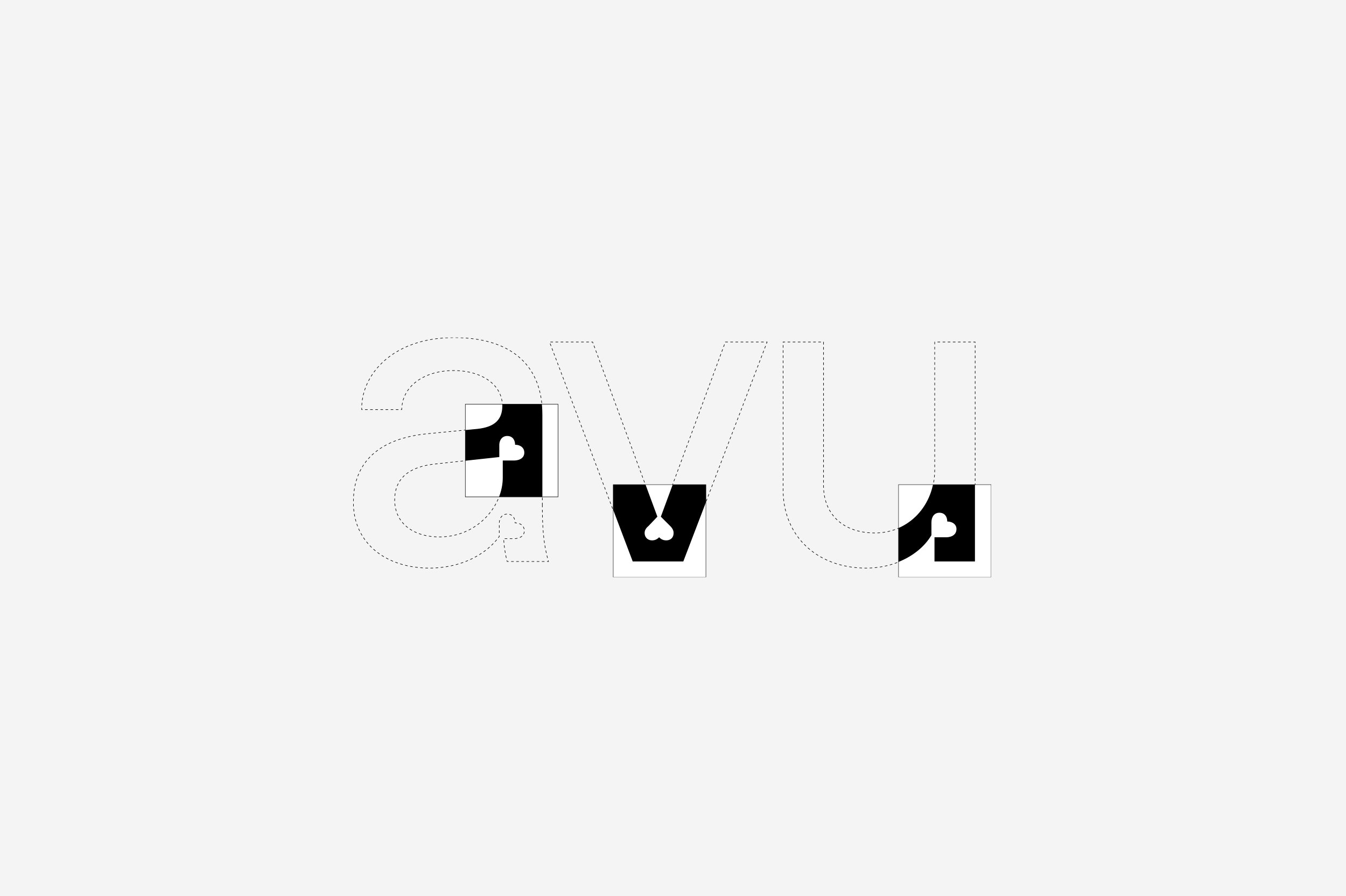
Guiding Principle
01 Guiding Principle

Basic Characters
02 Basic Characters

Text vs. Display
03 Text vs. Display

Posters & Invitations
04 Posters & Invitations

Poster Detail
05 Poster Detail

Catalog Spread Preview
06 Catalog Spread Preview

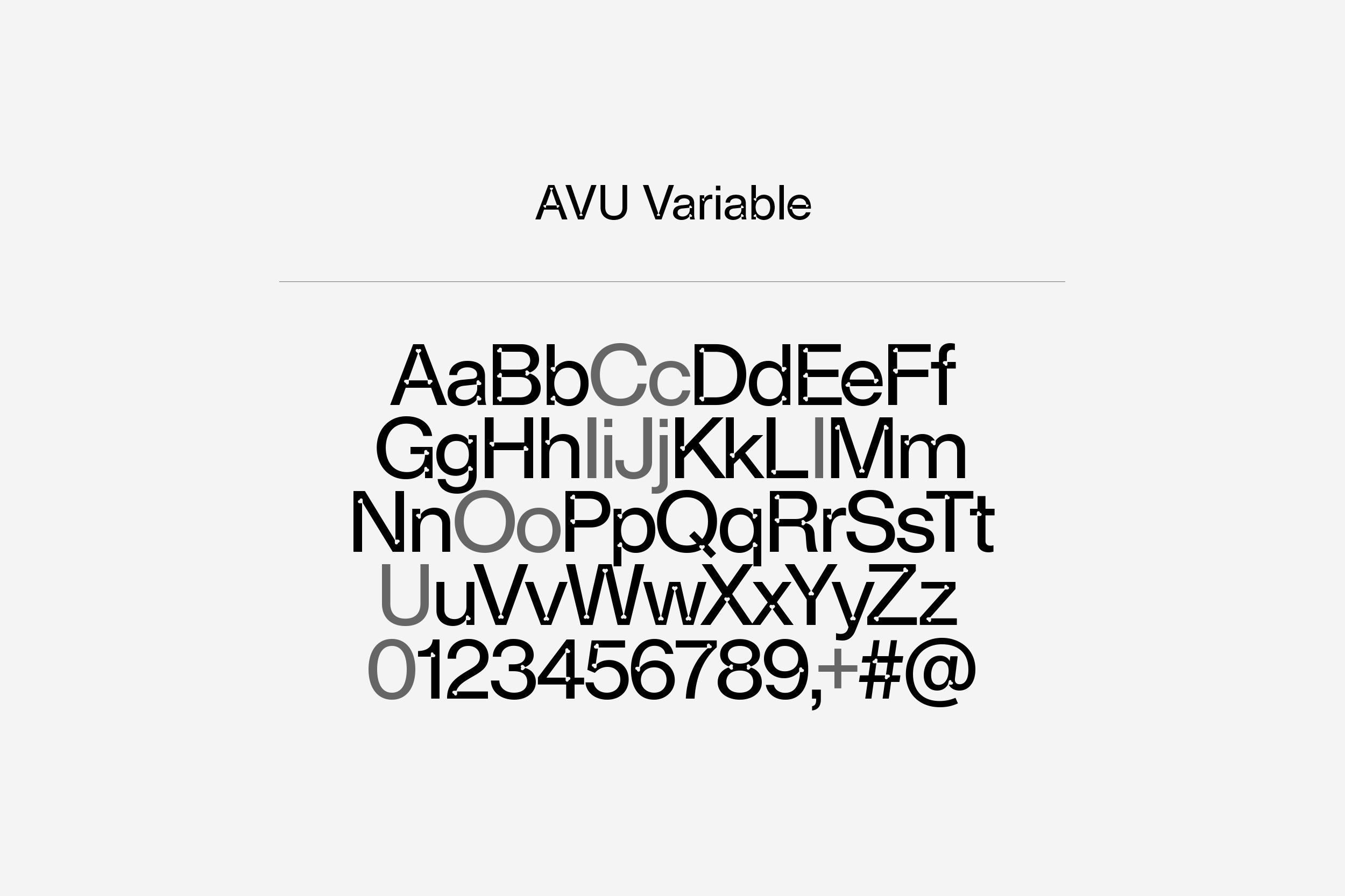
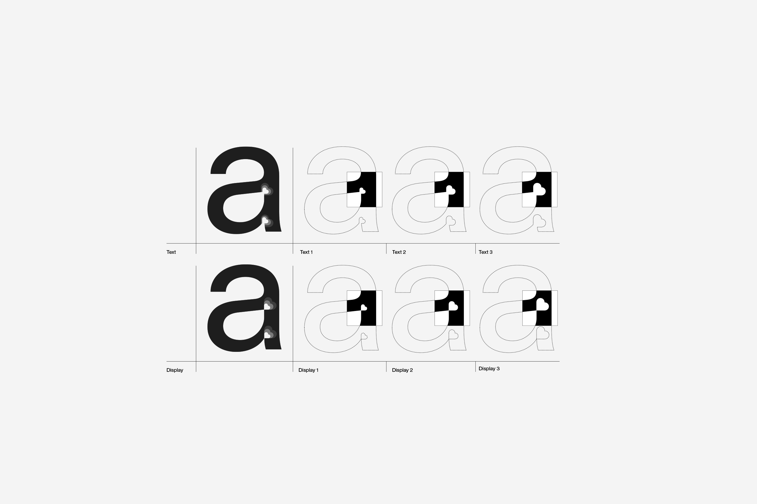
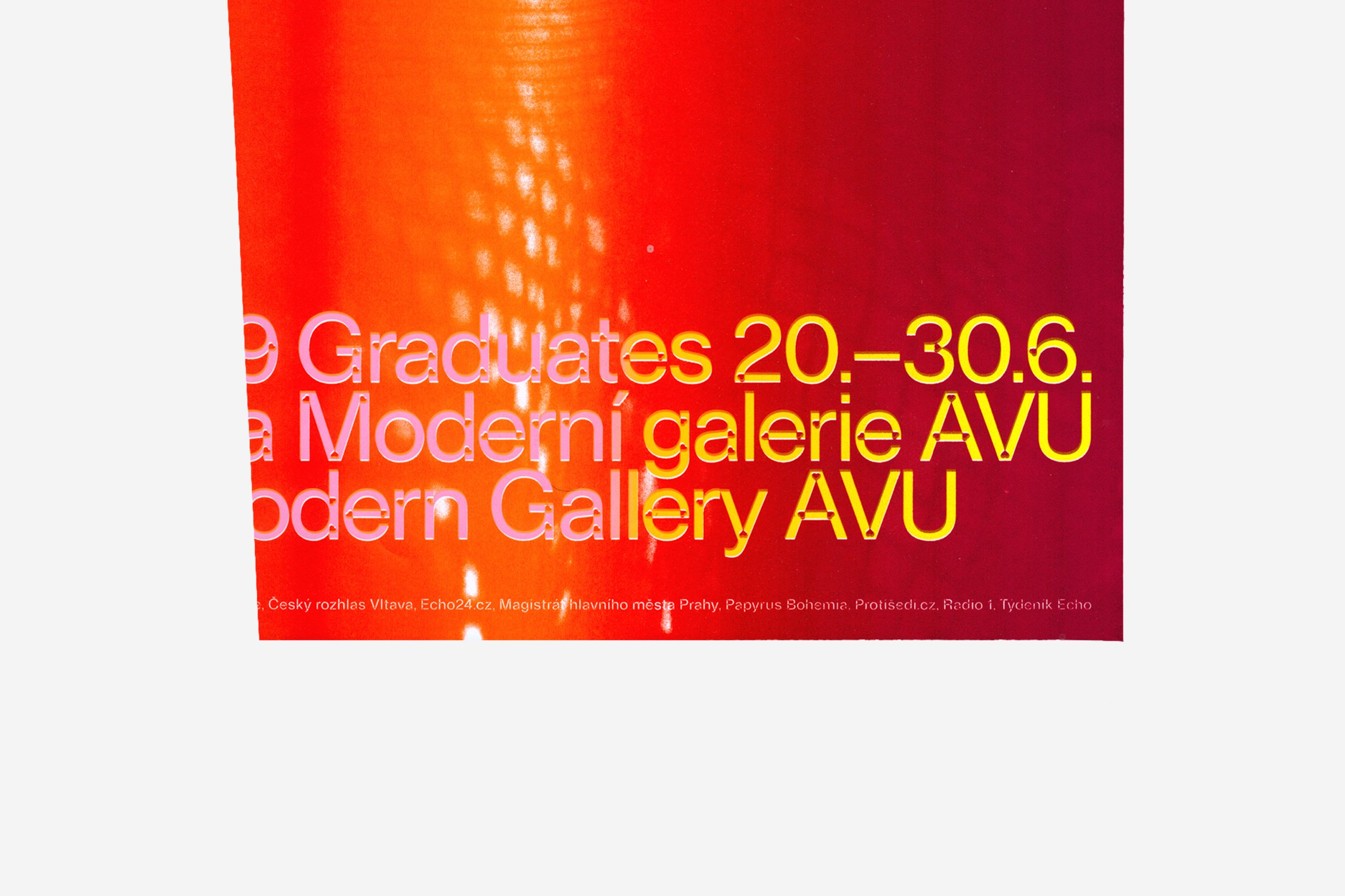
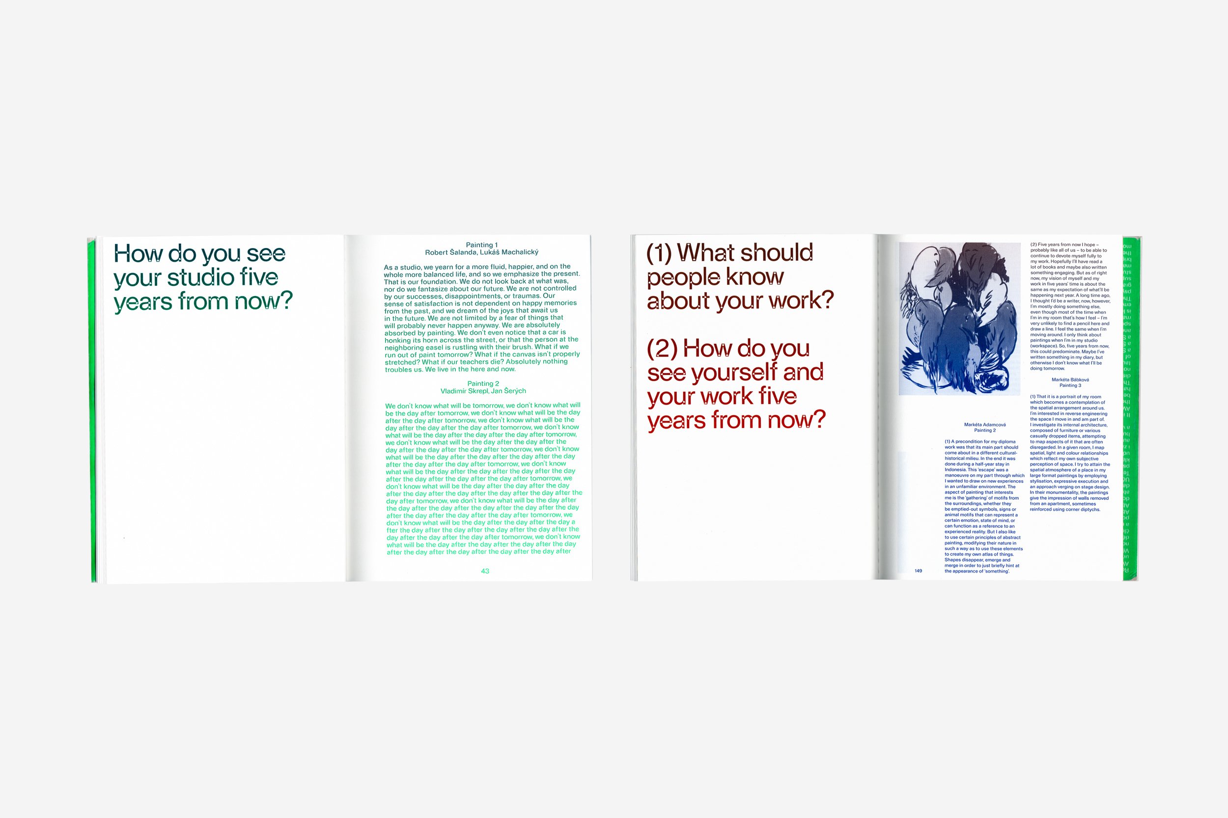
In 2019 the Academy of Fine Arts in Prague celebrated its 220th anniversary, and the celebrations included a long-awaited renewal of its graphic visual style. To this end it announced a competition, which we and 20YY Designers were invited to take part in. Within relatively short timeframes we jointly drew up a graphical concept based on a font whose graphics would be a continuation of Milan Knížák’s thirty-year-old logo, in which the Czech lion was supplemented by heart symbols of various sizes which, in combination with a coat-of-arms, created a relatively strong-looking visual element. While we wanted to preserve this to an extent, modern times require a broader range of applications, and the then-fragmented visual identity didn’t meet current needs. When narrowing the range of options to a choice of font forms, we mainly took into account the fact that the font would appear in close proximity to applied arts, which the font shouldn’t compete with through any excessive elements, which would be superfluous at this point. We also took into account the ageing of the visual identity, which is usually planned for an extended period of time, particularly with this type of institution. So we naturally tended towards a font that was strikingly similar to Helvetica or, if you want, Neue Haas, which have a certain neutrality. However, the shapes of characters were to contain the aforementioned hearts, which were evenly distributed in some internal corners of letters. So the hearts didn’t appear at all in the curves, and, so that they were balanced throughout the text, weren’t applied everywhere. Although it may not seem this way, this font has the attributes of both text and headline fonts, and the hearts are in different sizes as required. In the text they’re small, and in headlines bigger. In the font there isn’t such a big contrast between vertical and horizontal stems so that there is an even amount of space for hearts in the corners. The font is designed as a variable font, in which the heart beats within the letters.
In 2019 the Academy of Fine Arts in Prague celebrated its 220th anniversary, and the celebrations included a long-awaited renewal of its graphic visual style. To this end it announced a competition, which we and 20YY Designers were invited to take part in. Within relatively short timeframes we jointly drew up a graphical concept based on a font whose graphics would be a continuation of Milan Knížák’s thirty-year-old logo, in which the Czech lion was supplemented by heart symbols of various sizes which, in combination with a coat-of-arms, created a relatively strong-looking visual element. While we wanted to preserve this to an extent, modern times require a broader range of applications, and the then-fragmented visual identity didn’t meet current needs. When narrowing the range of options to a choice of font forms, we mainly took into account the fact that the font would appear in close proximity to applied arts, which the font shouldn’t compete with through any excessive elements, which would be superfluous at this point. We also took into account the ageing of the visual identity, which is usually planned for an extended period of time, particularly with this type of institution. So we naturally tended towards a font that was strikingly similar to Helvetica or, if you want, Neue Haas, which have a certain neutrality. However, the shapes of characters were to contain the aforementioned hearts, which were evenly distributed in some internal corners of letters. So the hearts didn’t appear at all in the curves, and, so that they were balanced throughout the text, weren’t applied everywhere. Although it may not seem this way, this font has the attributes of both text and headline fonts, and the hearts are in different sizes as required. In the text they’re small, and in headlines bigger. In the font there isn’t such a big contrast between vertical and horizontal stems so that there is an even amount of space for hearts in the corners. The font is designed as a variable font, in which the heart beats within the letters.