A2 Font, A2 Magazine
Custom Typeface 2014Project: A2 Font
A2 Magazine Custom Typeface 2014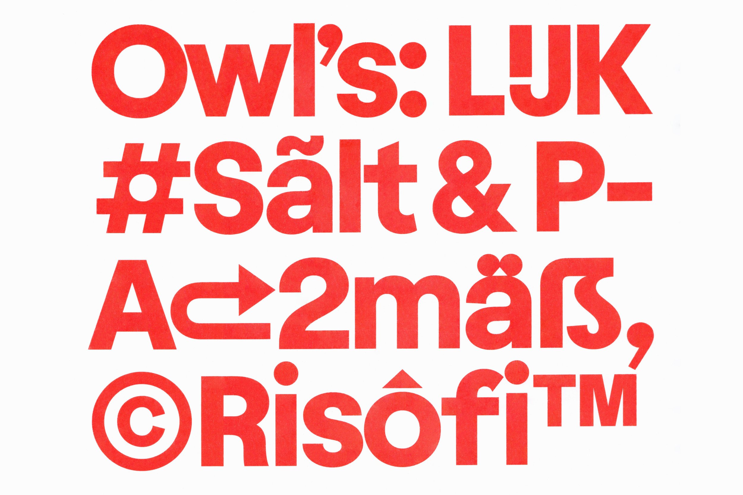
Printed specimen
01 Printed specimen


Printed specimen
02 Printed specimen

Printed specimen
03 Printed specimen

Printed specimen
04 Printed specimen

Printed specimen
05 Printed specimen

Printed specimen
06 Printed specimen

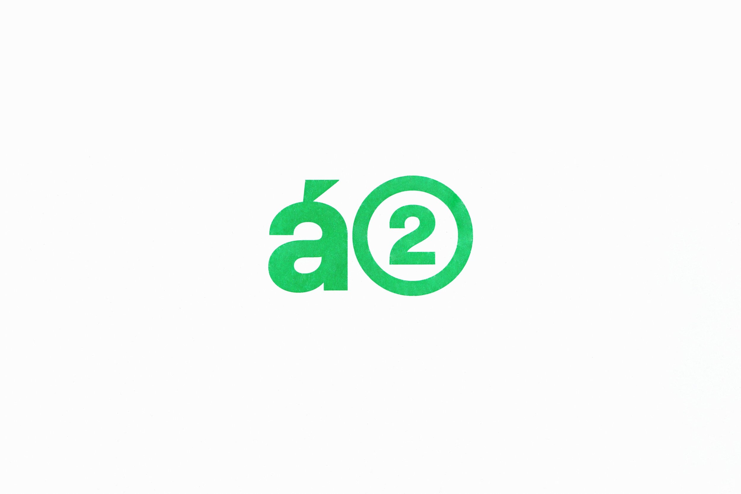
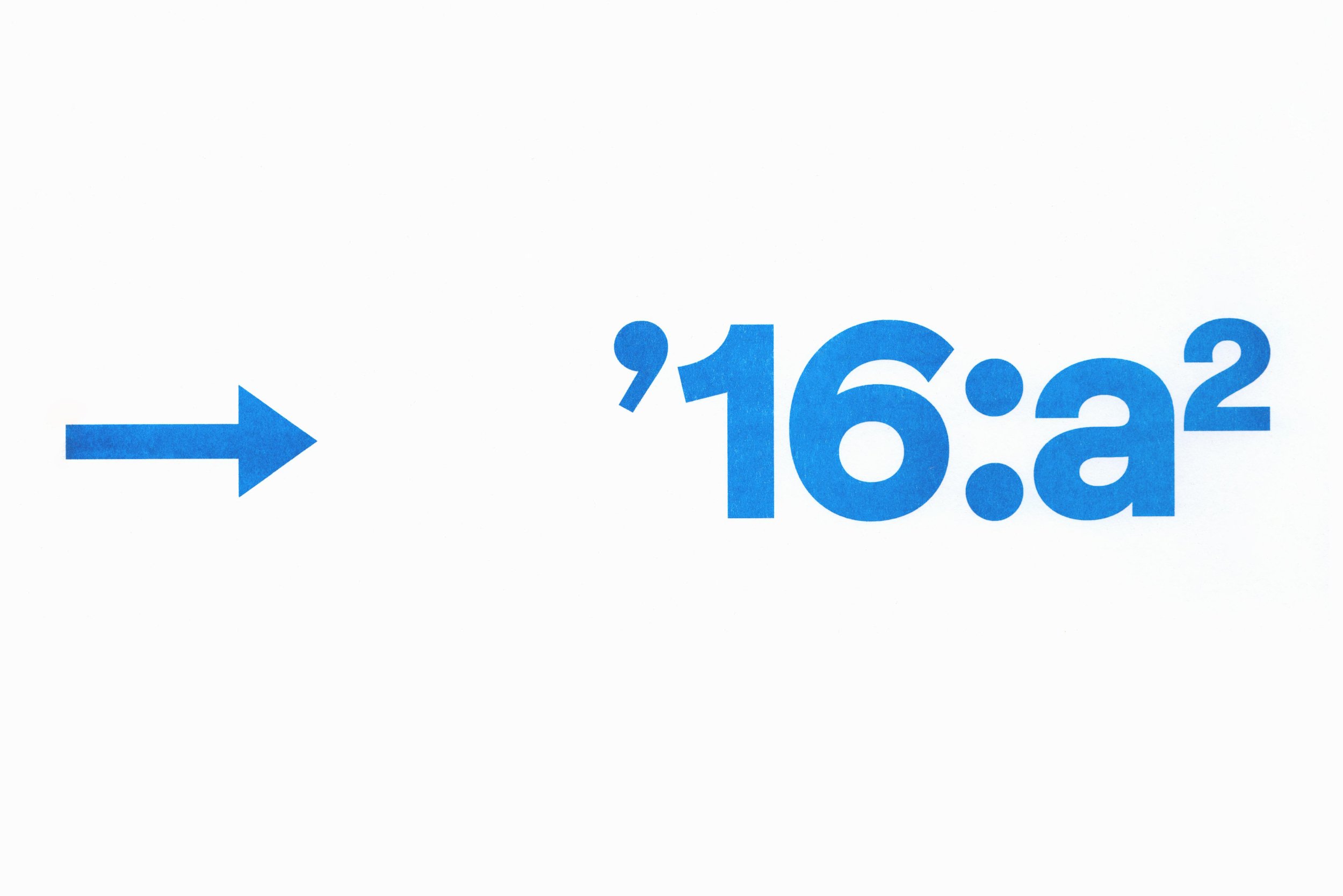
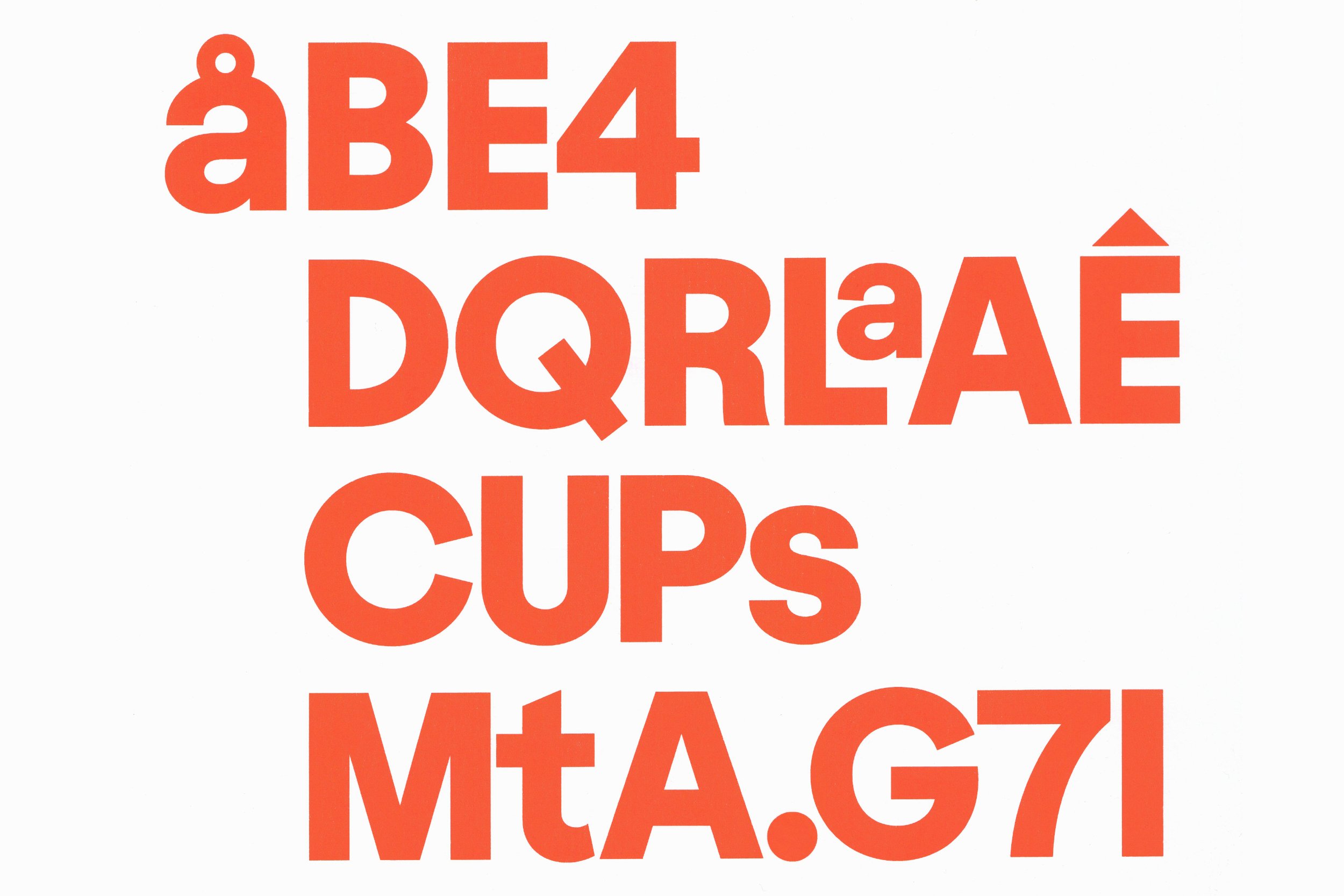
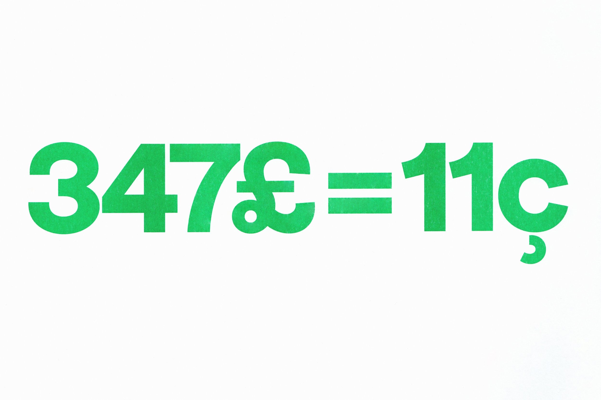
The A2 font is named as it is deliberately, in response to an assignment that arose spontaneously from the cooperation between our friends from Parallel Practice and the Mütanta studio. We were invited to take part in the project for a specially designed font for A2, which was then in a graphic redesign process. It is expected that custom-designed fonts for a specific purpose will stand out through their unique design and that the character set will contain something unique. This is double true of Ilustra, because the morphology of glyphs is relatively easy to distinguish thanks to its proportions and noticeable graphical shapes, which are subordinated to geometry. These attributes meant that we clearly fulfilled our tasks, which nevertheless contained a tougher nut with which we had no experience at the time. As part of the graphical accompaniment, the magazine layout also included various illustrations and, from a certain perspective, even the shapes of letters recalled an illustration. You could say that the first sketches included characters that were on the boundary between illustration and font. In themselves, the properties of all characters still met all the requirements for legible font, which itself was intended for the typesetting of titles only. These aspects increasingly appeared in the letters themselves, but, as Ilustra was used in Czech only, we focused on its accents, of which there are a lot in Czech. The most common are the caron, acute and ring. There was also a high likelihood of the occurrence of e.g. foreign names, so we included all characters from the Latin Extended A set, which also provided many opportunities for experimenting with morphology. Also worthy of mention are figures, characters such as the ampersand, number sign, arrows, currencies etc., which are among the most distinctive. In the future Ilustra will be included in the Heavyweight retail font collection.
The A2 font is named as it is deliberately, in response to an assignment that arose spontaneously from the cooperation between our friends from Parallel Practice and the Mütanta studio. We were invited to take part in the project for a specially designed font for A2, which was then in a graphic redesign process. It is expected that custom-designed fonts for a specific purpose will stand out through their unique design and that the character set will contain something unique. This is double true of Ilustra, because the morphology of glyphs is relatively easy to distinguish thanks to its proportions and noticeable graphical shapes, which are subordinated to geometry. These attributes meant that we clearly fulfilled our tasks, which nevertheless contained a tougher nut with which we had no experience at the time. As part of the graphical accompaniment, the magazine layout also included various illustrations and, from a certain perspective, even the shapes of letters recalled an illustration. You could say that the first sketches included characters that were on the boundary between illustration and font. In themselves, the properties of all characters still met all the requirements for legible font, which itself was intended for the typesetting of titles only. These aspects increasingly appeared in the letters themselves, but, as Ilustra was used in Czech only, we focused on its accents, of which there are a lot in Czech. The most common are the caron, acute and ring. There was also a high likelihood of the occurrence of e.g. foreign names, so we included all characters from the Latin Extended A set, which also provided many opportunities for experimenting with morphology. Also worthy of mention are figures, characters such as the ampersand, number sign, arrows, currencies etc., which are among the most distinctive. In the future Ilustra will be included in the Heavyweight retail font collection.